
2 min readBy Artcolor
CRI 90+ isn't the whole story. R9, TM-30 and the spectrum behind the white
Two strips with the same CCT and the same CRI can still render reds, skin and textiles very differently. What Ra leaves out, and how to judge colour quality properly.
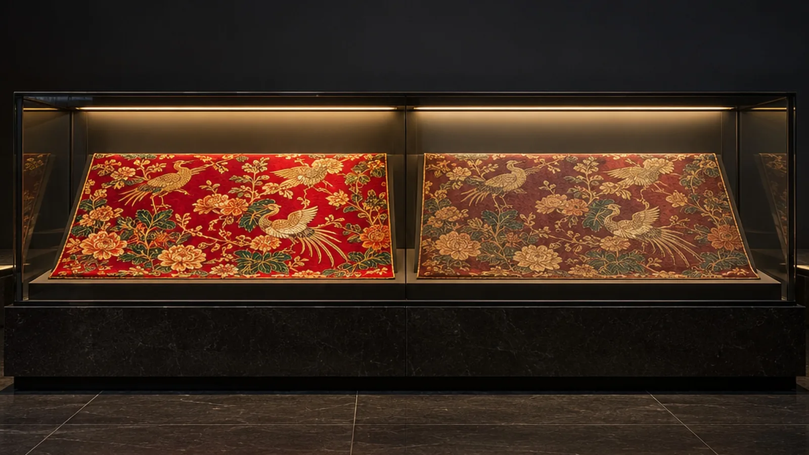
"CRI 90+" is on almost every LED strip specification sheet. It still can't tell you how a red silk, a walnut panel or a face will look under the light. Two strips can share the same CCT and the same CRI, and one showcase will make the fabric glow while the other makes it look tired.
What Ra measures, and what it leaves out
The general colour rendering index, Ra, is the average of how well a light source renders eight test colours. Those eight are fairly soft, mid-saturation colours. The saturated red sample, R9, isn't one of them.
That matters because many LEDs are weakest in deep red. A strip can score well on the eight-colour average and still render reds poorly, and red is exactly what people notice: skin tones, wood, food, leather, dyed textiles and the warm colours in paintings.
So a high Ra is a good first filter. It is not a guarantee.
Same CCT, different spectrum
CCT tells you the colour of the white. It doesn't tell you how the light's energy is spread across the spectrum. Two sources with the same CCT can have quite different spectra: one with a smooth, full curve, another with gaps and peaks. The white looks the same on a white wall. The difference appears on coloured materials.
As our technology page puts it: two sources with the same CCT can have different spectra, so evaluate how the chosen LED renders the colours that matter in your space.
What to ask for
- Ra and R9 together. R9 shows how saturated reds will look. For skin, food, textiles or artwork, include it in the approval brief.
- TM-30 where colour is critical. TM-30 describes colour rendering with two figures: fidelity (how closely colours match a reference) and gamut (whether colours look more or less saturated). For museums, galleries and luxury retail it gives a much fuller picture than one index.
- The spectral power distribution. Comparing the spectra of two candidate LEDs explains differences that the summary numbers hide.
- The real material, in the real optic. Judge the light on the actual fabric, stone or artwork, with the strip inside the diffuser and profile it will be installed in. A diffuser changes the light that reaches the object.
A practical approval routine
Our approach to sample approval is to compare spectral power distribution, CCT, chromaticity, flux and colour rendering at the agreed operating conditions, then approve the sample in its intended diffuser and profile, alongside the actual display materials.
A number puts a strip on the shortlist. A sample on the real material should make the decision.
Where to start
Our reference AS2835 strip specifies Ra >90 and SDCM <3. For a higher-CRI brief, we review the exact LED, CCT and natural-spectrum options, then confirm the target against the chosen sample. You can see our natural-spectrum LED strips, or tell us what you are lighting and we will suggest samples to compare.
- Guides
- LED strip
- Colour rendering